

.png)

.jpg)
Table of contents
When a digital product lives on several platforms, its interfaces must perfectly adapt to all of them, from sizing and interaction patterns to visual consistency. This gives users a seamless experience on any device they use.
We call this responsiveness.
To achieve it, designers must create layouts, interfaces and components that rearrange themselves to fit the space available. However, manually designing for several specific screen widths, known as breakpoints, is very time consuming. It also increases the chances of components and variants proliferating, which can compromise consistency and make library maintenance an absolute agony.
Luckily, there is a way to make your life easier: Figma variables.
With variables, you can have the whole interface magically adapt by changing just one parameter – the screen breakpoint. There’s another bonus here too: a single component can cover all possible contexts of use. You eliminate the need for countless variants and manual edits.
Sounds interesting? It is!
How we do it
Let’s make it as easy as uno, due, tre.
Step 1: Define your breakpoints
The first step is pretty simple. Let’s say your product is available on desktop, tablet and mobile. Identify standard sizes for each, and set them as the main breakpoints. You’ll have three different breakpoints, each defined by a screen width and height.
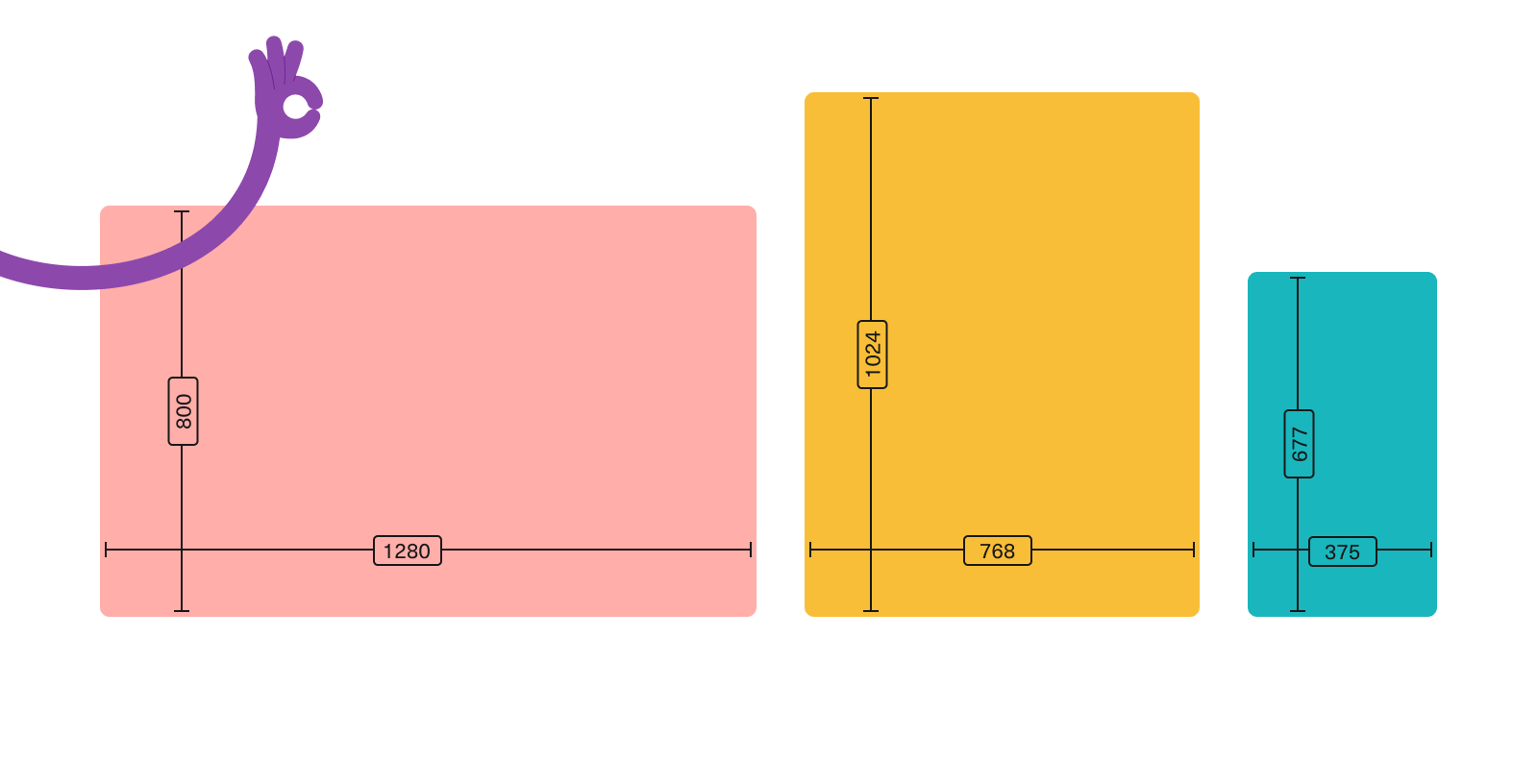
To make sure your designs are responsive on all possible screen sizes, you can add two extremes to the list. This will allow you to test your designs on unusual screen sizes, so that you know that everything works just fine regardless of the device your users choose. We suggest you add an ultrawide desktop screen and a very small phone screen.
At this point, it’s time to document!
Breakpoints should be defined at the design system level, as they are global settings that all future components and layouts should adapt to. For this reason, we recommend documenting them in your design system’s foundations. And if you need some help working on foundations, worry not! We just wrote an article about how to build sturdy foundations for your product’s design too.
Step 2: Set breakpoint variables and modes
With clear breakpoints, it’s time to put them to good use. This means transforming those width and height values into Figma variables. To help you, we’ve created a template Figma file complete with a playground section. You can download the Figma file to start experimenting.
In your ‘local variables’ menu, create a new collection (in our template, we called it ‘Responsive’). This collection will contain two variables; screen width and screen height. Now, set up modes, one for each breakpoint. You should end up with a table-like structure that you can fill with the width and height values you defined in the first step. Something like this:
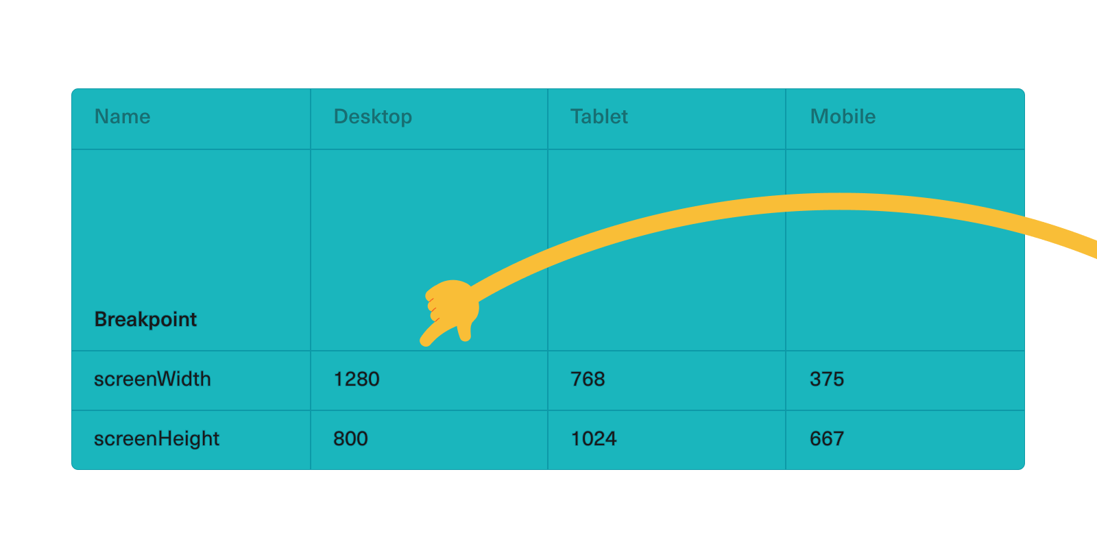
Remember: the mode on the left side of the table is always the default in Figma, so it should be the one you primarily design for.
Once you have these variables in place, you can apply them to any new frame created. Just by selecting the right property, the frame will smoothly switch from one format to another.
Step 3: Create your first responsive component
Finally, the most exciting part: making your components responsive. This is where you make sure your components automatically adapt to the breakpoints.
We’ll explain it with an example.
Let’s say you have a card. This card has some features – width, font size, padding, and icon visibility – that should adapt to the size of the screen. To make each feature responsive, you need to set some variables that are applied at the component level.
The process is the same: go to your local variables and add one variable for each responsive feature. This time you won’t need to define breakpoints, as the ones you set up earlier still apply. Now you just need to populate the table with the right values et voilà! Your setup is ready.
There’s only one thing left to do: select your card component and apply all the variables you just defined to the corresponding features. Now, when you drop your card component into a frame, it will adapt, and when you change the frame breakpoint the card will change too.
Good job – you’re done!
Reaching breakpoint
As most digital products live on different platforms, responsive design is often unavoidable. Reducing the time it takes to create interfaces for different screen sizes leaves you free to dedicate your energy to more valuable activities – like improving the users’ experience on the product or geeking out over the latest Figma updates (we’re still buzzing about those new page dividers).
Figma variables make this possible, automating the adaptation process and allowing you to focus on usability and functionality instead of repetitive adjustments.
∗ ∗ ∗
Want more insights?
- How to build sturdy foundations for your product’s design
- A design system to build design systems
- What’s the recipe for a successful handoff?
Want a safe pair of hands to help with your own design system?
Check Design System Audit, our service to make sure your design system brings you results.

